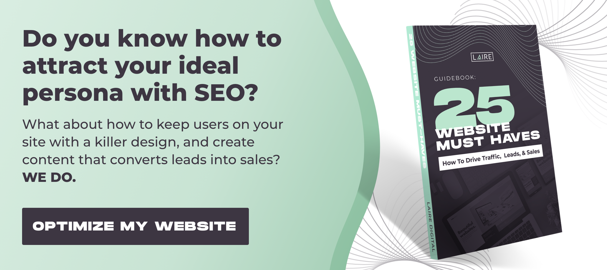

Contact forms for websites serve as a direct line for potential leads to reach out when they’re ready to learn more — while also helping your business capture valuable contact information. Though they may seem straightforward, the design and structure of your form can significantly impact conversion rates.
Here are 9 dos and don’ts of contact forms that can make or break your performance.
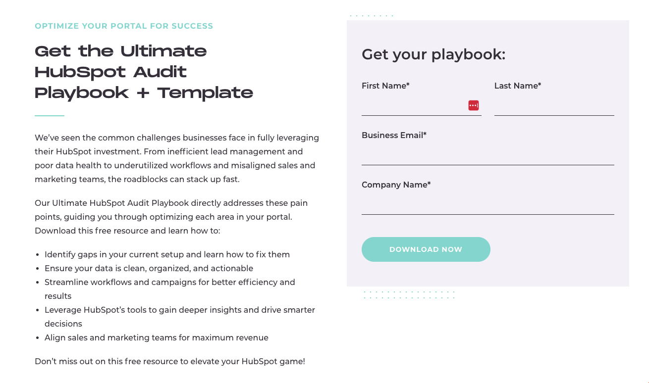
Do: Tell the User Why They Should Fill Out Your Form
Your contact form is the gateway to valuable information for your audience. Clearly communicate your value proposition and set expectations for what users will receive after submitting the form.
For instance, if you're offering a free eBook, highlight key takeaways with bullet points to show users exactly what they'll gain from downloading it. Here’s a contact form example that does just that:
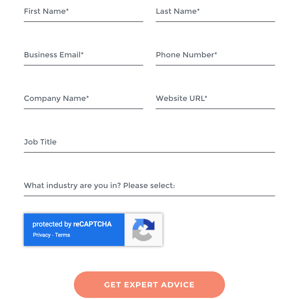
Don't: Include Unnecessary Fields
A lengthy form can feel overwhelming to users, potentially discouraging them from completing it.
Your contact form should strike a balance — gathering enough details to identify user needs while keeping the process seamless. The ideal form length depends on factors like where the user is in the sales cycle and the information your team needs for effective follow-up.
For prospects early in their journey, a simple contact form with minimal fields may be the best approach. Users in the awareness stage may be hesitant to share extensive details, so keeping it short and straightforward can improve conversions.
Do: Provide Alternative Contact Methods
Not everyone prefers using contact forms — some users may dislike waiting for a response.
To accommodate different preferences, offer alternative contact options such as a phone number or email. This allows potential customers to engage with your business on their terms and move through the sales process at their own pace.
 Don't: Ignore the Button
Most form builders default to using “Submit” as the button text, but this generic wording doesn’t set clear expectations for the user. Instead, customize your button text with actionable language that guides the user on what to expect next.
Phrases like “Download Now” or “Let’s Get Started” create a more engaging experience and encourage form completions.
Do: Take a Look at Your Analytics
To understand how well your contact form is performing, regularly review your analytics. Metrics like conversion rates and bounce rates provide valuable insight into the user experience on your page.
If your form isn’t meeting expectations, make incremental changes and test their impact. For example, try reducing the number of fields and monitor whether it improves your conversion rate. Small adjustments can lead to significant improvements.
Don't: Stick With One Layout
If your contact form isn’t performing as expected, consider adjusting the layout. Placing labels above each field and positioning the form on the right side of the page often lead to higher conversion rates.
Don’t hesitate to experiment with different layouts — just be sure to track your analytics to measure the impact of any changes.
 Do: Follow Up With an Email
When a user submits your contact form, it's the perfect moment to engage with them immediately. Send an automated, personalized follow-up email thanking them for reaching out and either providing additional information or requesting further details.
A timely follow-up keeps your business top of mind and strengthens the connection with the user. Monitor email open rates to identify opportunities for improving your messaging or format for better engagement.
Don't: Use an Inline Thank You Message
After submitting the form, users should be immediately redirected to a thank-you page. This is a great opportunity to engage them further by including links to your social media profiles, valuable resources like an eBook or special offers, and your most popular blog posts.
The thank-you page encourages users to explore more of your content and spend additional time on your site.
Do: Get Help If Needed
If your contact forms aren't performing as you'd like, don't hesitate to get expert help. An inbound marketing agency like LAIRE can provide the insights and support you need to optimize your forms — and much more!
Ready to take the next step? Let’s schedule a free 20-minute marketing consultation to discuss your contact form challenges and how we can help you improve them.