TABLE OF CONTENTS
What Is CRO? | How to Find Your Conversion Rate | Conduct a CRO Audit |
Strategy Behind Landing Page Optimization | Landing Page CRO Checklist | A Landing Page We Love
Unlocking the secrets to boosting your website’s conversion rates has never been more critical. Your website is a digital hub of potential customers, where every click counts. Life moves fast but digital marketing trends move faster, and mastering the art of conversion rate optimization (CRO) converts website visitors to customers.
Although every digital asset that you have can be optimized, we’re going to focus on optimizing your website’s landing pages to increase conversions.
What Is Conversion Rate Optimization (CRO)?
Conversion rate optimization, or CRO, is the process of increasing the percentage of users that complete a specific action in order to generate more leads. Teams use existing conversion rate data to run tests and improve conversion workflows.
Ongoing conversion rate optimization services are a budget-friendly, proven way to increase the number of leads that convert on your website.

Conversion Rate Metrics Are Marketing Data Royalty
A conversion rate is the percentage of actions taken after a visitor lands on your website. Depending on your team’s marketing plan, the action a visitor needs to take to convert can vary. Some conversion actions include:
- A content offer download
- Secondary call-to-action clicks on a thank you page
- Subscribing to a blog
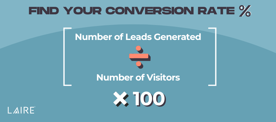
The formula to determine conversion rate is the number of conversions or leads generated divided by the number of visitors multiplied by 100.

After calculating your percentage, you’ll have a better picture of whether your digital asset’s conversion rate is high or low.
According to Wordstream, “the average landing page conversion rate was 2.35%, yet the top 25% are converting at 5.31% or higher. Ideally, you want to break into the top 10% — these are the landing pages with conversion rates of 11.45% or higher.”
A high conversion rate indicates that your team is running a successful campaign. Visitors are finding value in your digital assets and are happy to swap their information to convert and access your content.
Let’s use landing pages as a conversion point example…
A form fill on a landing page is the action a visitor needs to take to be considered a conversion. Visitors will take a desired action when it is beneficial to them. Therefore, a low conversion rate on your campaign’s landing page could indicate that website visitors aren’t finding value where you want them to.
Before your team creates an optimization strategy, you will want to conduct a CRO audit — or hire a conversion rate optimization agency to do the heavy lifting. A CRO audit will include all of the conversion data of all the assets attributed to your campaign.
Conduct a CRO Audit and Analysis to Inform Your Optimization Strategy
Gather all data from the digital assets in the campaign you’re optimizing. If your team uses an integrated CRM, we recommend attributing all campaign assets to a centralized ‘hub’ (we love HubSpot’s Campaigns tool) that your team can audit and analyze quicker.
For example: Imagine that your campaign’s landing page is not performing as you had planned. After completing an SEO audit and analysis, your team has decided to optimize your campaign’s landing page to increase conversion rates. But what makes a landing page that converts?
The Science and Strategy Behind Landing Page CRO Optimizations
Landing page optimizations (LPO) aim to improve landing page performance by creating a more compelling, targeted message for visitors, which will guide them to convert. A good starting point is understanding:
- What is the primary goal of the page?
- What do we want that page to do for our users?
- Is the page accomplishing the goal?
Common goals can convince users to purchase a plan or product, subscribe to a blog or newsletter, start a free trial, or contact the team, for example.
Use Conversion Data to Inform Your Landing Page Optimization Strategy
Your audience will ultimately determine your LPO. Think about your visitors’ journey: How did they get to your landing page? Are there any potential barriers when visitors navigate to the page? Most importantly: What will make your target audience convert on your landing page?
For example, if your landing page is receiving a substantial amount of views but minimal conversions on your call-to-action (CTA), the user may not understand how helpful your offer actually is.
Once you have a better understanding of what your visitors want to know, take stock of your page. Use our CRO checklist to identify strategies to optimize your campaign’s landing page.
The Only Landing Page CRO Checklist You’ll Ever Need
Conversion rate optimization best practices may include shifting the location of a call-to-action, switching up the design or language in a CTA, relocating or renaming menu items, editing the title or header text for clarity, replacing outdated imagery, or making minor button updates (whether that be location, color, or verbiage).
Now that your team has nailed down what the landing page is going to do, follow this checklist to optimize a landing page that converts.
Landing Page Copy
- The page content supports the chosen CTA.
- The page has a clear purpose and value proposition.
- The title/headline communicates value and says something meaningful.
- The CTA copy is descriptive and sounds desirable.
- The copy has been proofread.
- There is a single CTA, so the user stays focused on the goal.
- The page has a descriptive title tag and meta description.
Landing Page Design
- The page has a visually appealing color scheme that creates interest for the user.
- The page is not cluttered.
- Whitespace is used around the focus elements of the page.
- There are directional cues that focus the user’s eye toward the CTA button or form.
- The CTA contrasts with the rest of the page.
- The CTA button looks like a button.
- There is a CTA button above the fold.
- There are clear sections and an order for the user to process the information.
- The font style, size, and color were chosen wisely.
- The page has a visual focus.
- The page is consistently branded with our business’s brand standards.
- The images have alt text.
Landing Page Functionality and UX
- The form only asks the user for necessary lead information.
- The form length is not intimidating for the user.
- The links are working.
- The page is easy to navigate.
- The page speed has been optimized.
- The page is mobile-friendly and responsive on multiple devices.
- The page is at an optimal length.
- There is a ‘Thank You’ page that discusses the next steps post-conversion.
- Unnecessary distractions have been removed.
- Menu and navigation options have been simplified.
A Landing Page We Love (And Why It’s Awesome)
HubSpot’s State of Marketing Report
HubSpot’s annual State of Marketing report is a must-read. Moreover, the report’s landing page is a great example of a landing page that converts.
Why We Love This Page
Hubspot removed the main navigation in the header, opting instead to display the brands that contributed to the report.
Why it works: Landing pages are a vehicle for site visitors to take action. Removing your site’s navigation module gives visitors an opportunity to focus on the offer.
The page’s CTA is a large, high-contrast button and a pop-up form on click. The CTA is repeated in the middle and final sections of the landing page.
Why it works: When CTAs are visible and accessible, visitors have a better chance of converting. Visitors can focus on the message instead of the transaction. Repeating the call-to-action at the end of the page also gives visitors a second chance to convert after reading the page.
The below-the-fold content sets expectations for the report and highlights an emerging marketing topic (AI marketing tools) and key statistics. When the reader scrolls further, they see some of the marketing channels in the report with CTAs that all link to the pop-up conversion form.
Why it works: If a visitor knows what to expect, they feel more confident swapping their information for your content. Highlight what matters most to your target audience and tease that information on the page.
Ongoing CRO Audits Create Landing Pages That Convert
Conducting ongoing conversion rate optimizations is a surefire way to increase the number of visitors that convert on your digital assets.
A high conversion rate goes a long way in driving revenue. Get started with a CRO audit of your campaign assets to find and test new optimization opportunities. For each test that you run, you’ll form new hypotheses that will inform your next test.
While you’re optimizing your landing pages, you might find opportunities to update your website. These are the 25 website must-haves to have a killer online presence >>


