Case Study Overview
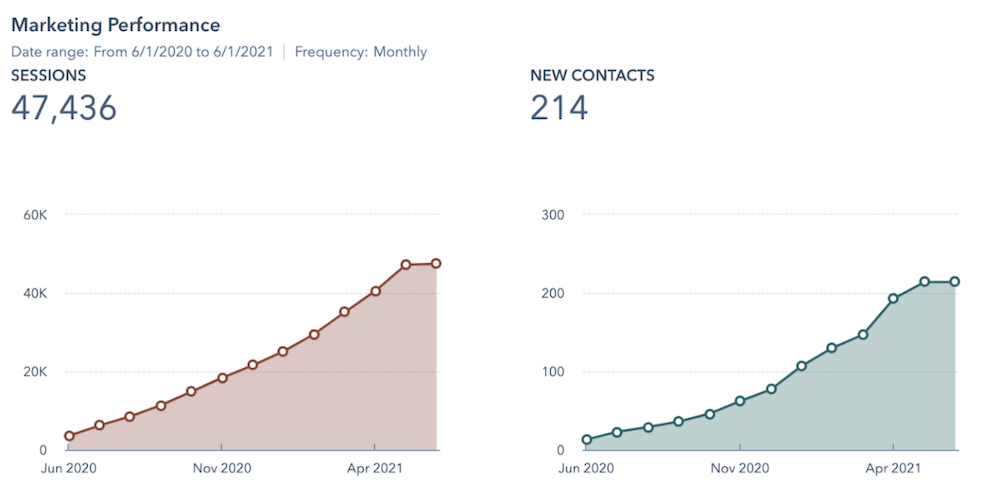
LAIRE’s website revamp was quite the undertaking. With a complete brand change leading the charge, the clear method for us to use in designing our website was Growth-Driven Design (GDD). From an average of 772 site visitors per month in 2018 to over 3,900 site visitors per month in 2021, our website continues to be updated based on what our customer data tells us.
Background
Agency Rebrands and Redesigns Website with Growth-Driven Design
If you’re a small business owner or entrepreneur, you can probably relate to our website’s evolution. Our website had seen many iterations over the years of business, starting with a templated site, to then various semi-custom designs. Our team was small and focused on delivering quality work to clients, so we dedicated little time to improve our own digital presence. Our website was out-of-date, and an incomplete view of our services and client successes.
In 2018 the agency grew due to client referrals. An increased book of clients led to a larger agency team, and we committed to increasing our own content marketing efforts. As a result, we experienced the subsequent gradual growth in website traffic, however, there was a limit to what our current website could provide for users, and limits in lead generation, unless major changes were made.
We wanted our website to look the best it could, and represent a strategic and creative agency. We were adding agency services that weren’t explored on our website, so we knew we needed to create more pages. Also, we were working on our own agency rebranding, with a new logo, colors, and imagery, and the website needed to incorporate those elements and embody the new brand aesthetic.
These were a lot of elements to coordinate, and we knew that if we held the site launch until all of these components were fully fleshed out, our website would continue to be a poor representation of our agency, and would limit our possible growth. So we decided to approach our website redesign/rebuild using Growth-Driven Design.
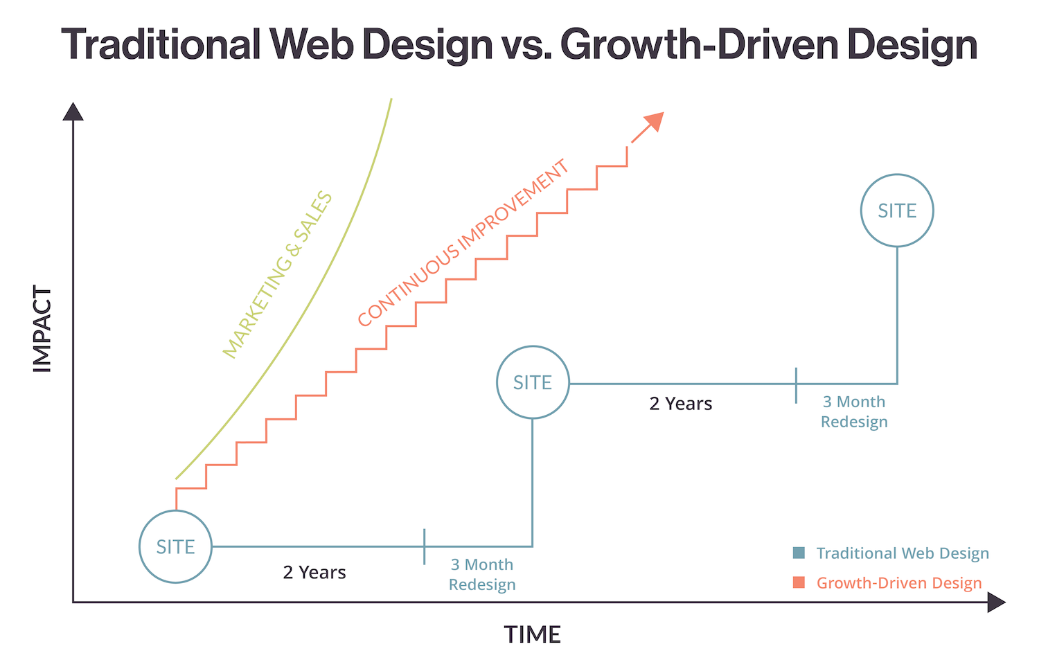
This approach is NOT one that is completed in one large overhaul as one might imagine with traditional website design. Growth-Driven Design is a continuous effort to ensure your website is making changes that come from data from your real customers and site visitors. GDD is a continual effort to make site updates that make sense for your company and your leads. Friction of user experiences and lead conversions are avoided, and the usability of your customers takes the first priority.
With traditional website design, the stakeholders traditionally oversee the site and what content will be included. While this content may make sense for these decision-makers, it does not always take into account the buyer’s journey or what potential clients might be searching for. Additionally, traditional website designs take a large time to launch with increased costs due to delayed work. Much of this, if not all, is eliminated with Growth-Driven Design.
The Goal
A New User and Brand Experience, and Improved Lead Generation Through a Website Redesign
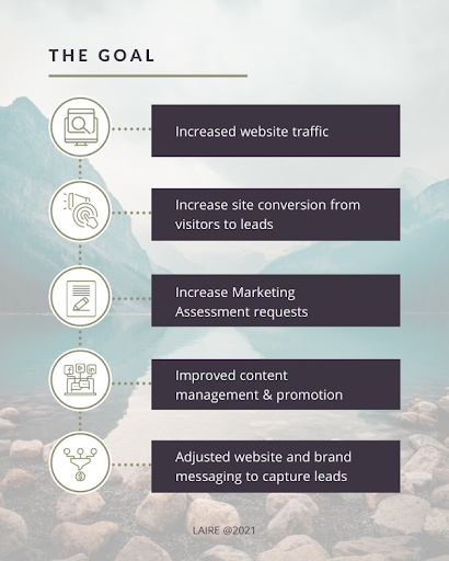
We knew that the redesign we implemented should not just increase brand awareness, but also positively affect our key performance indicators of:
-
- Increased website traffic
- Increase site conversion from visitors to leads
- Increase Marketing Assessment requests
- Improved content management & promotion
- Adjusted website and brand messaging to capture leads
The other goals we had for the website were to connect with specific industries we serve, by building comprehensive pages and resources to speak to their pain points and create multiple conversion points on each page to increase lead generation.
Our Strategy
We started the planning process in summer 2019 and published the launchpad site in June 2020. The site continued to grow, with new pages added monthly and quarterly to get to our (nearly) full website vision in June 2021.
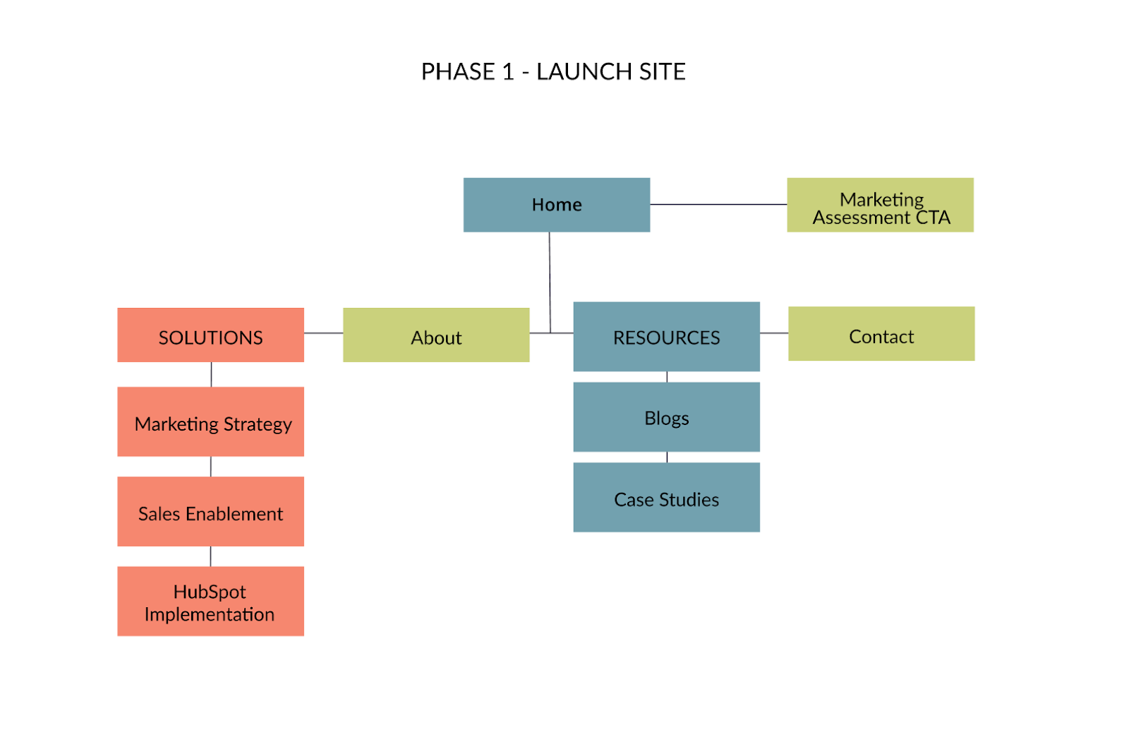
Below is the initial sitemap of the launchpad site. Phase 1 included the key pages we needed to promote, including our main services, resources for prospects, and pages where leads could convert.
*Color Coding: We labeled Awareness-stage pages blue, Consideration-stage pages coral, and Decision-stage pages green.
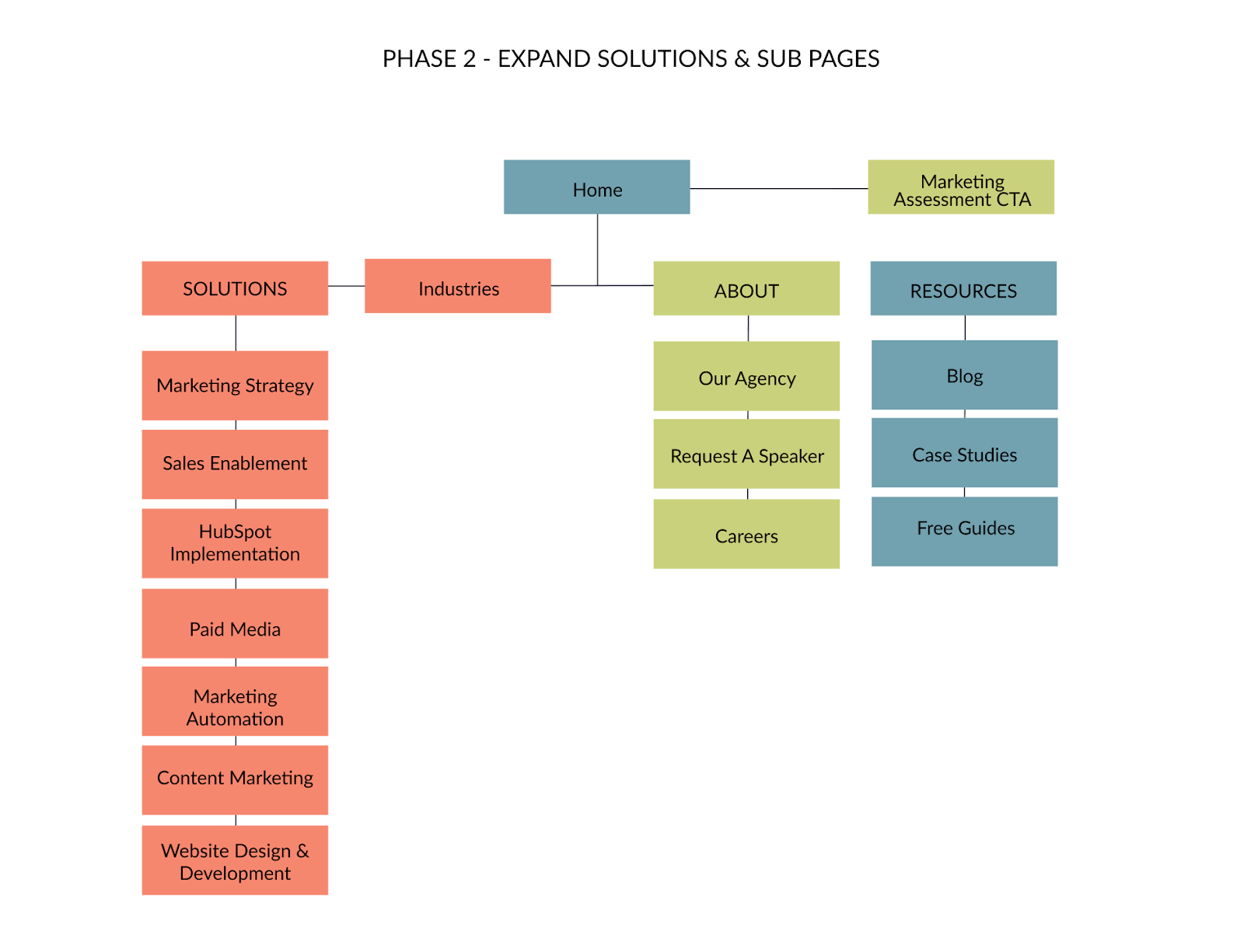
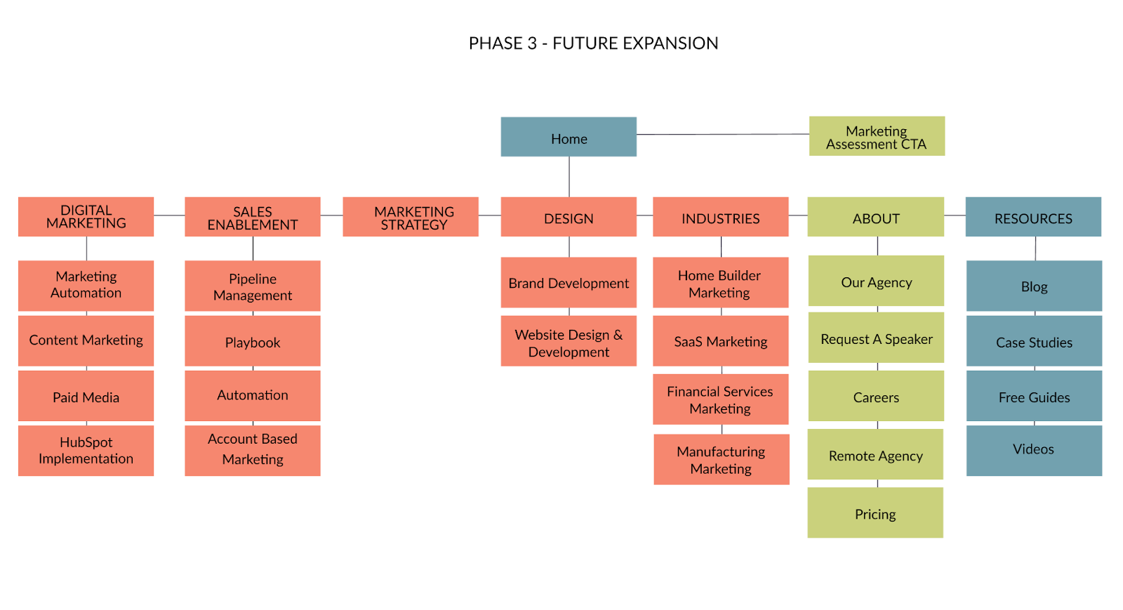
In Phase 2 of GDD, we added more Solutions pages to expand our promoted services, additional About pages, and expanded resources for prospects -- this included a listing of our free, downloadable guides and their respective landing pages with conversion forms. We also introduced an Industries page, with the goal of the next phase to create specific industry breakdown pages under it.
While we say that a website is never done being built, the Phase 3 sitemap closely represents our original goals with the website -- to have Solutions pages divided by business focus, and more fully explore the key industries we serve.
Our Tactics
The website redesign plan included the following focuses:
Content Inventory
We started by taking inventory of all our blogs, resource downloads, and website pages. We could see how many blog articles needed to be moved or optimized, or what was not relevant and should be unpublished. This content inventory also gave us an idea of what topics and areas needed to be written about. If we had minimal resources dedicated to a specific industry, we ensured an effort was made to beef up those sections.
User Experience Mapping
Understanding the path a user should and could take on the website is vital to increase website conversions. We installed a heat mapping tool on our current website and also used Google Analytics to understand where the user journey ended. We then made clear mappings to paths we wanted visitors to take, so we were sure to include these plans in our page design and architecture plans.
Sitemap Planning
As you can see above in our 3 phases of sitemaps, we mapped the actual pages that will be launched throughout Growth-Driven Design. This set clear expectations for our team and made the work in each phase very focused on the pages at hand.
Expanded Solutions
It was important to our team to give real estate to each marketing service we offered. We wanted business owners and clients to be able to easily find and drill down into their marketing needs, so building comprehensive Solutions pages with related resources was a focus of our content creation process. We launched the site with our three largest services and then added to the Solutions pages over time. Having these expanded pages also allowed us to rank higher on search engines for the keywords related to our services, leading to improved visibility and authority.
Custom Website Design & Branding
Inspired by our new brand guidelines, a custom design was created for the website. Knowing that our own site would become a sales tool for our web design services, we pushed for innovative layouts and updated imagery. Post-site launch, we continue to make updates to modules and page layouts so the design stays fresh, and we test conversion rates by making changes to color and design elements. For example, we recently changed our blog page design from grey to white to improve readability on mobile devices.
HubSpot Website Development
When building websites for our clients, we use the HubSpot platform for its superior ease of use, content management, and technical support -- so it was the only choice to use when building and hosting our own site. Our team of HubSpot developers works to code the site so that every element on a page may be simply edited and managed. Our team of marketers needed the freedom to edit copy, change images, add modules, and add pages over time.
Results
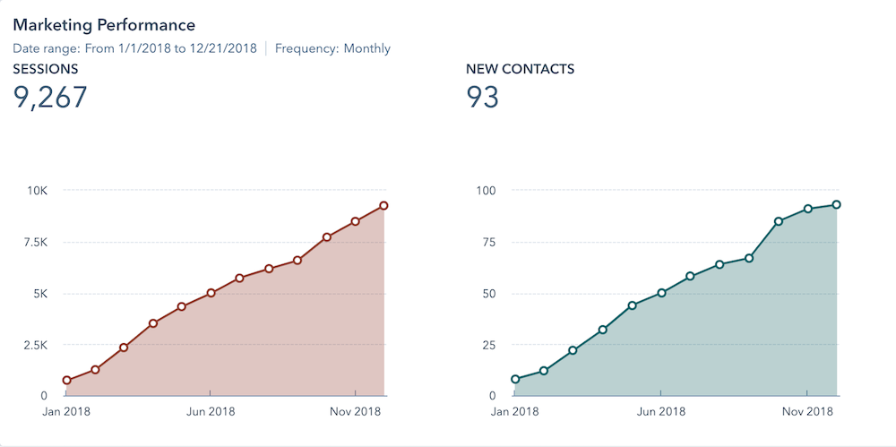
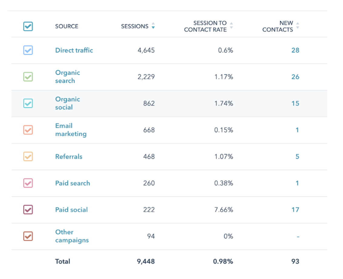
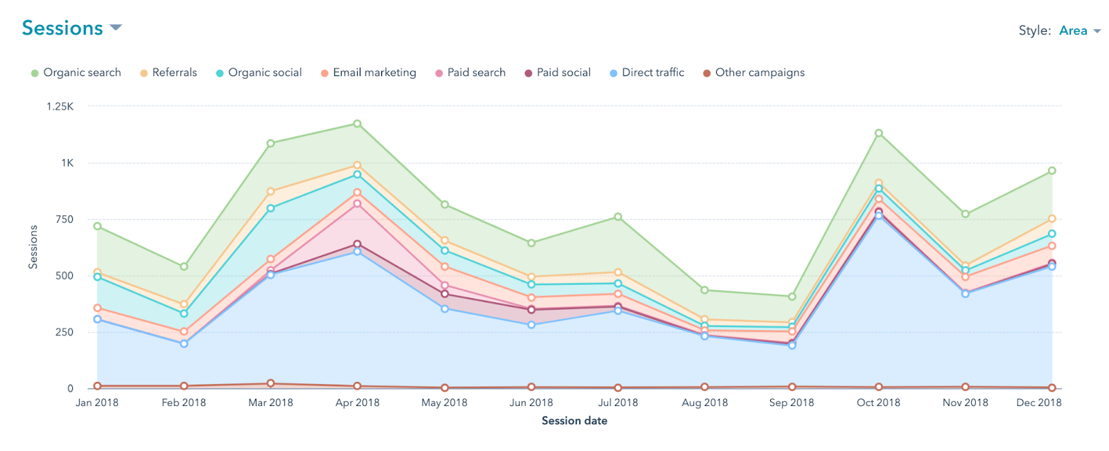
View of 2018 Website Traffic (January - December):
- Average of 772 website visits/month
- 93 new contacts
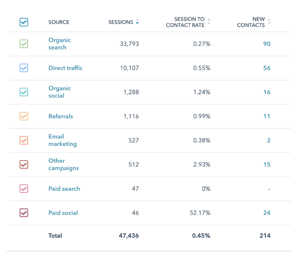
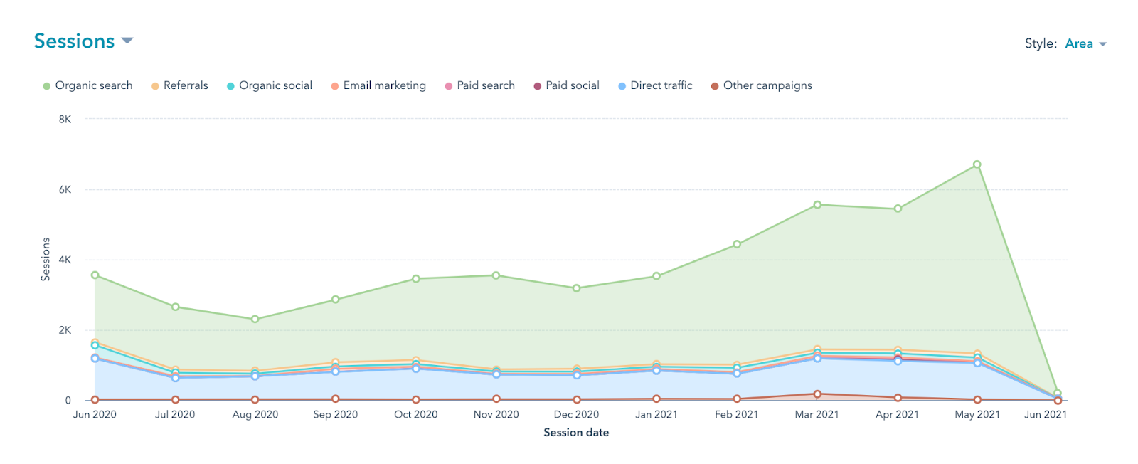
- Organic search traffic represents 49% of traffic
View of 2020 - 2021 Website Traffic (June Post Launch - June One Year Later):
- Average of 3,900+ website visits/month (growth of 511%)
- 214 new contacts (+230%)
- Organic search traffic represents 71% of traffic
